The LGBT+ flag was created in 1978 by the artist Gilbert Baker, on request of Harvey Milk, the first US official who declared himself openly gay. It comprised 8 colours: pink, red, orange, yellow, green, turquoise, indigo and purple. According to Baker, each colour symbolised an aspect: from sexuality (pink) to life (red), healing (orange), sunlight (yellow), nature (green), magic (turquoise), peace (indigo blue) and the spirit (purple). The American artist wanted to create a flag that would represent a positive message not only for the community, but also for those who continued to view the homosexual reality with suspicion and hatred. That is why he chose the rainbow, a symbol of peace and agreement as the new manifesto of gay love.
The eight-colour rainbow flag was abandoned the following year, in 1979, since pink had become too expensive. Eventually, in the 1980s it was decided to make the colour stripes even by merging turquoise and indigo into blue. This formed a rainbow flag of six colours (red, orange, yellow, green, blue and purple).
In 2015, the Museum of Modern Art (MoMa) classified the rainbow flag as an internationally recognised symbol and purchased the original eight-colour flag and displayed it in the contemporary design gallery. Moreover, the LGBT flag has recently become the subject of various rainbow washing phenomena, i.e. social or marketing activities aimed at presenting a reality as gay-friendly in order to increase public acceptance. Of the many operations along these lines, the one by the municipality of Milan is highly commendable. In 2018, the city put up rainbow posters and painted benches in its colour all over the city, these installations became permanent in the Porta Venezia metro station on line 1.
The variations of the flags are many, from the More Colour More Pride Flag or Philadelphia Flag, in which the city of Philadelphia added two colours (black and brown) to include black people, making it an even more inclusive symbol of the LGBTQI+ community.
To the bisexual pride flag created in 1998 by Michael Page featuring three colours: pink representing attraction to people of the same sex; blue as a symbol of attraction to people of a gender different from one’s own; purple symbolising attraction to two or more gender identities.
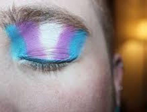
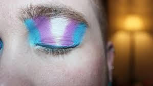
The trans flag created in 1999 by Monica Helms, a transgender woman, and first used during the Phoenix Pride which includes the following colours: blue which symbolizes boys and pink which symbolizes girls, colours that end in the middle which is white, symbolizing those who are transitioning, those who are gender neutral, agender or intersex.
The leather flag used by all lovers of S&M, leather fetishists, BDSM and other practices related to this community. It was created by Tony DeBlase and displayed for the first time ever in 1989 at the Leather Contest in Chicago. It includes a heart which is the symbol of love and the colours white, which stands for the purity of love, black, which stands for leather, and blue which stands for denim.
The lesbian pride flag with shades of pink, white and purple colors; a Butch for lesbian women with masculine features, with shades of blue; an agender flag for those who reject the idea of having a gender identity, but also for those with other types of non-binary identities is made up of a black stripe representing those who have no gender identity, a gray stripe indicating gender-neutral people, a white stripe representing all genders, and a green stripe indicating non-binary in general.
Flags for asexual and pansexual orientation were created in 2010: the asexual flag inspired by the logo of the organization Asexual Visibility and Education Network, which represents both graysexual (the fluid area between sexual and asexual) and demisexual (people who experience sexual attraction only as a result of emotional connection) identities while the pansexual flag which includes the colors: pink representing the attraction to girls, blue for the attraction for boys, and yellow for all non-binary people and unspecified genders.
The polysexual flag created by Samlin in 2012 and shown to everyone via Tumblr, represents the attraction to several genders, but not all. It includes the color pink that symbolizes the attraction to the female gender, blue for the attraction to the male gender and green for the attraction to non-male and female genders.
The flag for aromantic or “aro” people (people who do not feel any romantic or sentimental involvement) which includes the dark green a color that represents aromanticism; light green represents the aromantic spectrum; the white stripe represents platonic and purely aesthetic attractions; the gray stripe represents grayromantic people (those who might feel romantic attraction, but not frequently) and demiromantic people (those who feel romantic attraction only after establishing an emotional bond); finally, black that symbolizes the spectrum of sexuality.
The genderqueer flag that includes the colors: lavender to symbolize androgyny and queer, white for genderlessness and green for all people outside the binary gender.
The Intersex flag created in 2013 by the organization Intersex International Australia, it includes two colors, yellow and purple, which are understood to be neutral colors that have never been used to define a sexual gender.
The genderfluid and non-binary flag, created in 2015, is meant to represent the possibility of fluctuation and the flexibility of genders. Therefore, it includes colors associated with femininity and masculinity, alongside with colors that represent all or no other gender. The colors are pink which stands for femininity, white for the absence of gender, purple for the combination of masculinity and femininity, black for all genders, including the third gender and blue for masculinity.
These are just a few of the flags that symbolize the infinite declinations of gender and sexuality that continue to emerge, enrich, and color human beings.
Associazione Paradigma

Scrivi un commento